- From our Sponsors -
A reader asked a question that really resonated with me. She started by saying that design is subjective and then wondered if someone could ever devise a list of principles that could define good design. So, I thought, "Why not give it a try?", and here it goes.
There are two parts to the question, being the first one the affirmation that design is subjective. Personally, I don’t think that’s a fair assessment of design but I understand where it’s coming from. People tend to mix design and art in the same bucket and the proprieties of one sometimes drip on top of the other.
Art is subjective, it’s like a game where there are almost no rules. Design is different, and the fact that someone can put together a list of principles should already tell you that there are some rules to the design game. If there are rules, then we can tell whether or not these rules are being followed, which means that design is not subjective. However, to be fair, I can’t really say that design is 100% objective, there are always things that come down to personal preference that is determined by your culture and experiences.
Related: You can now raise money on BEAM
Now, this "tiny" level of subjectivity doesn’t mean that you can’t tell good design from bad, it just means that you might find a good design “ugly” or in the other side of the spectrum, you might find something that looks beautiful that actually is a pretty bad design. Let’s look at one example.

I think almost all can agree that this is a beautiful piece of design but the million-dollar question is, does that make it a good design?

Why? Because it has so many functional problems that I won’t even bother to write them here (just go to amazon and read the reviews if you are interested and/or want to have a laugh, or read this), but in short, it doesn’t do a good job in the only thing that it’s supposed to do, help you to get that fresh juice.
This to say that it’s possible for something to be "good looking" but still be a bad design. You just need to look beyond the looks, and to help you do that I devised a list of 6 "check points" that you can use to filter the good from the bad. There is a lot of nuance involved, so I’ll try to expand each of these check points.
Based on the lemon squeezer, I think you can already guess the first one…
The need for design is usually driven by a problem that needs to be solved. It might be a website that needs to be easier to use, a product that needs to appeal to a certain audience or a new business that needs a logo, the problem can be literally anything.
This is the first check point to diagnose whether or not a design is good. If it doesn’t solve the problem, you don’t need to go any further, it’s definitely not a good design. It doesn’t matter how good it looks if it doesn’t even accomplish the main purpose of its existence.
I find this one of the main reasons why many designers get so frustrated with their clients/bosses. They tend to jump into “design mode” without fully understanding the problem and just try to make something cool, that will improve their portfolio. They forget that we’re not designing for us but for someone else, and we need to address their needs, not ours.
In order for your design to be effective is crucial to understand and empathise with your client/user. Before you start designing, ask “Why?” until you really understand the true goal that your design needs to accomplish. Sometimes the client might think that they need one thing but after a few questions you'll realise that they actually need something entirely different. This is the only way that you can be certain that you’re trying to solve the right problem.
Related: You can now find jobs on BEAM
If your design is effective, you can move on to the next check point.
For you to be able to tell whether or not the tone is appropriate, first you'll need to figure out two things, the brand and the audience.
The brand
The term “brand” is usually associated with businesses but it’s not limited to them, many things can have a brand, even you. Your brand is the perception that people have of you, the same applies to companies and pretty much everything else.
Good design helps a company take control of their brand, and shape the public's opinion to match how they want to be perceived.
The audience
A company usually has a target audience and it might vary from something broad to a very small niche. If you know how the company wants to be perceived and who the design is for, the remaining question is, what is appropriate for them?
Generally speaking, the broader the audience the cleaner and more conventional the design needs to be, that’s why you see many companies losing part of their “soul” as they grow. This happens because certain design gimmicks that will work for small niches won’t stick with a larger audience, therefore the company “sacrifices” that to attract more people. On the other end of the spectrum, when your audience is smaller and very specific you can rely on those gimmicks to make the design attractive and engaging to them.
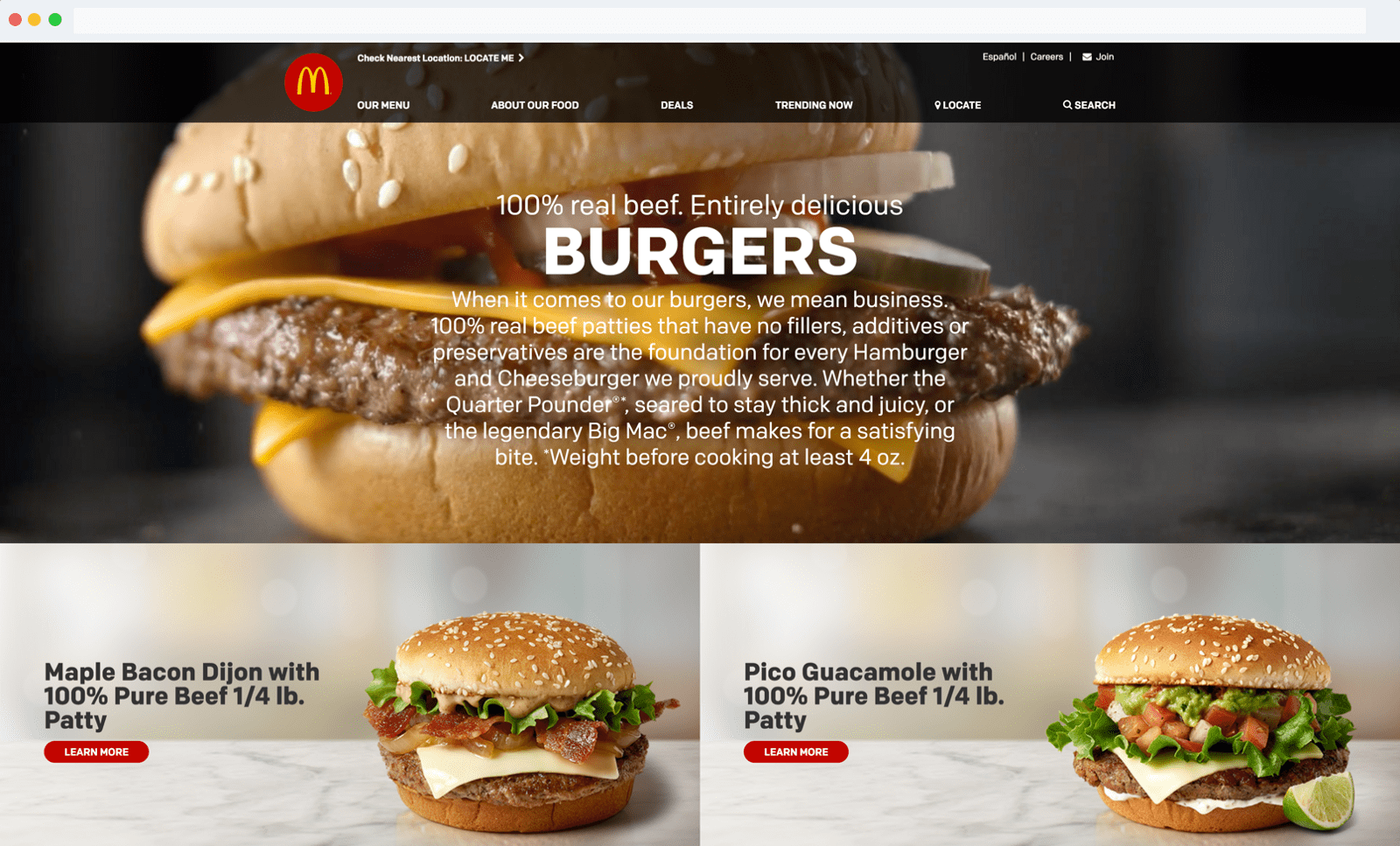
A good example to understand this is to compare McDonald’s with your local burger joint. They basically sell the same thing, but they communicate in very distinct ways.

Your local burger joint usually capitalises on the latest trends in design that attract people who identify with that, like the funny illustrations you can see on Byron’s website. On the other hand, McDonalds communicates in a more conventional way to cover a more general public trying not to patronize or alienate anyone.
In short, to understand if a design passes this second check point, you just need to know what is the appropriate tone and if the design is successful in communicating it. If it is, then you’re one step closer to a good design.
Good design is sensitive to time.
Ideally, you’d want a design that is timeless, however, that is not always necessary or even advised. It really depends on what the design is trying to accomplish and its life span.
If you’re designing a webpage for a product that will be replaced or updated in two years, for instance, it probably makes sense to take advantage of the trends of the year to get ahead. This will help your design seem contemporary, modern and relevant. However, you should try to stay ahead of the curve and see where the trends are going. There’s nothing worse than catching the wave too late, this will only make you look bad, like you’re trying to catch up rather than being the one setting the trend.
Related: You can now raise money on BEAM
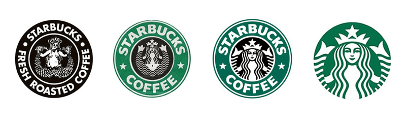
In the other hand, if we’re talking about a logo that is supposed to last for years or decades, then yes, you should definitely avoid design fads that come with a short expiry date. If you look at well-known logo redesigns like the Starbucks logo, the trend is to make them simpler as time passes, thus the simpler you make it, the longer it will last.
With this in mind, to pass this check point, you just need to understand what’s the life span of the design you’re analysing and judge it accordingly.
Is the design appropriate for it’s life span? If so, hang in there, there’re only three more check points to go.
Friction is whatever is in the way of the person reading/using something. The more friction you add, the harder it is for them to get what they want from your design. Basically, friction is generated by things like text that is hard to read or a website that is difficult to use.

This might seem like an obvious mistake, but you would be surprised how many times designers end up sacrificing readability and usability to make their design “look better”.
It’s important to measure the amount of information that you want to present very carefully. Avoid information overload, that will only add friction to your design. For that, you really have to understand what your viewer/user needs, and in a lot of cases, you even have to distill that information and make it digestible.
“A wealth of information leads to a poverty of attention.”
— Marty Neumeier
If the design is well done, it will become invisible and people will easily find what they need. If it’s not, then you’re most likely staring at a bad design, because good design is frictionless.
You’re close. There’s only two more things to consider.
Back into subjectivity land. This is the part that most people like to focus on, and the part that generates more discussions and controversy. This happens because it can be subjective at times and it’s hard to agree on something when all we have are opinions.
However, there is a way to break part of this subjectivity. You just need to learn the principles that make design visually appealing. These are the elements that you’ll find consistently across examples of good design.
Related: You can now find jobs on BEAM
I wrote an overview about them in the post I referred in the beginning of this article, and will do a more thorough breakdown in the future.
Besides learning the theory, you should also enrich your visual culture. You can do that simply by looking at design that is featured by the design community in websites and books. If you do that, you’ll start to see the patterns that keep reappearing in good design like well-balanced compositions, beautiful typography, precise alignments, delightful colour combinations and many other things.
This should be enough to get you in a good path, nonetheless, in the end of the day, this check point will always be a bit subjective to go through, but since this is just one out of six, it shouldn’t disable you from distinguishing good design from bad. As I said in the beginning, good design is not always beautiful to everyone.
The next check points is not only the check point but also the finishing line.
If the design passed the previous 5 check points, you have already a really good design in front of you, this check point is what takes it from good to extraordinary.
To reveal if a design has more than the sum of its parts you just need to look closely. Essentially this is when a design goes beyond a combination of good typography and colours, it’s when there’s a brilliant idea that supports everything and takes it to a whole new level.

A simple yet perfect example of this is the FedEx logo, just take a close look at it. Between the E and the X you’ll notice a small arrow cleverly hidden in the negative space. This arrow is meant to symbolise the company’s accuracy and speed.
This is what differentiate good from great designers. Good designers will rely on their technical skills and base their design on principles (a machine could learn that by the way), but great designers bring more to the equation. I think that this is what creativity really is.
In a nutshell, good design has more than what meets the eye, it’s not only about how it looks, but a combination of a series of thoughtful decisions that are made with the end user/viewer in mind.
Related:
- From our Sponsors -