- From our Sponsors -
The logo design industry is changing at a lightning-fast speed. What was trendy five years ago may not even ring a bell today. As methods of attracting customers become more effective, logo design must keep up the pace. New ideas develop so fast, designers have a hard time following them.
Fortunately, experts are committed to studying short-lived trends and forecasting where the logo design industry is heading. With the help of my team, I’ve put together a list of 10 trends that will dominate 2018.
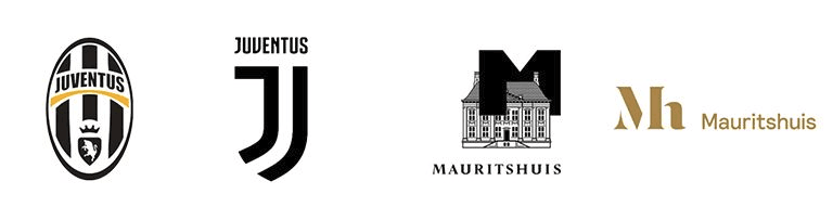
This trend is all about stripping your design to the basics and making it as clean and minimalist as possible. Advancing internet technologies and cross-platform requirements are among the factors that revived this trend. Your emblem must look good across all mediums, from business cards to websites and mobile apps. This is why some major brands have revamped their logos, giving them a sharper, edgier look.
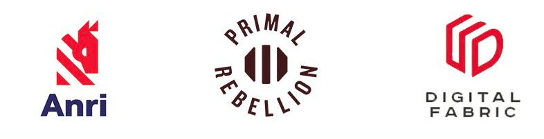
Legible font coupled with simple geometric shapes (lines, points, rectangles, circles) will continue to hold ground. Having emerged in 2017, this powerful trend is gaining momentum fast. What makes it special?
First, logotypes are known for their simplicity and coherence (think Samsung, Nike, and Google). Second, simple graphic elements give your emblem a balanced, consistent look. Finally, if used wisely, clean geometric shapes can create strong visual effects and elevate your logo among those of your competitors.

Here’s another hot trend for logotypes. The idea is to place words on top of each other, making long phrases easier to perceive. This trend made big waves in 2016-2017, and it seems like companies can’t get enough of it. Sophisticated and elegant, it will continue holding ground in 2018. Letter stacking works well with contrasting colors. It’s a surefire way to achieve originality and the grab attention of potential customers.

The year 2017 brought us multiple logos imitating ancient coats of arms, emblems, stamps, etc. Text is usually placed inside a circle or semicircle, with dates as a common element. Reserved colors and clear graphic shapes create strong retro vibes. Such logos evoke associations with tradition, heritage, and longevity.

In logo design, slices are wide parallel lines that seem to make “cuts” in the logo. This trend will become even bigger in 2018, and here’s why. First, slicing adds some air to the emblem, making it easier to absorb. Second, you can use this technique to add smart effects and visual illusion (think negative space). And last but not least, slices give your logo a textured three-dimensional look.
This technique does not need an introduction. Logos with negative space have been around for a few years, and 2018 will be no exception. The trend has evolved over the years, shifting from logomarks to logotypes. Now we see more text logos with shapes and images hidden inside or between the letters.
It looks like 2017 has been dominated by logotypes. As a major branding weapon, typography is far from being fully explored. In addition to the techniques mentioned above, designers have experimented with kerning, spacing, font combinations, and much more. Look at the masterpieces one can create with a bit of imagination! Are we going to see more of these graphic delights in 2018? You bet!

Graphic designers rediscovered the power of gradients in 2016-2017, but the trend won’t fade away anytime soon. Color transitions can be successfully applied to both icons and text, especially for a massive, bulky font.

Overlaying vibrant colors creates a brand-new hue, giving depth to your design. MasterCard’s recent logo overhaul breathed new life into the technique, proving that it fits all kinds of brands, including high-profile companies.
Although it’s being replaced by minimalist trends (like those discussed above), lettering still holds its position. A plethora of industries, including cafes, barber shops, and photo studios, will continue exploring the power of this trend. Prepare to see more logotypes with intricate inscriptions!

That’s it! Covering all the popular techniques would take forever, but these are the top 10 trends you need to look out for in 2018.
Author Info:
This article was first published by Holinay Vasyl on TheNextWeb
Related:
- From our Sponsors -